


Plantations Packaging
Plantations Packaging
Branding : Interactive and compostable packaging
UID : 2015 : 1 Week
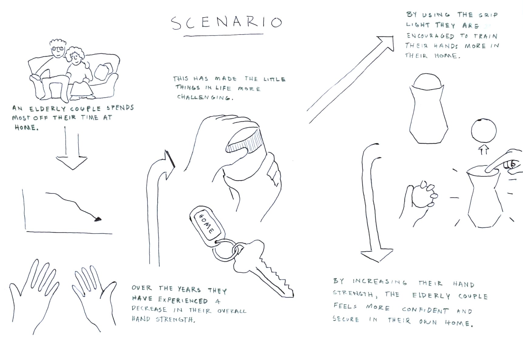
Redesign Plantation chocolate's existing packaging
I was afforded the opportunity to work with a local Swedish chocolate company for a one week packaging redesign and branding. The deliverables for the project were:
a giftbox – where some of the chocolate products can be combined
the closure of today’s chocolate bars (today they get ripped when opened and can’t be reclosed...)
“Plantations Chocolate works with the local Ecuadorian cocoa farmers and teaches them techniques that will not only improve the taste of the chocolate but also it’s value as an export.”
WHAT IS PLANTATION CHOCOLATE?
Plantation Chocolate is a chocolate producing company with a focus on providing the highest quality chocolate possible. In the pursuit of this goal the company has developed strong relationships with local Ecuadorian farmers. While the company's focus is producing chocolate, a very large part of the company's mission is to improve the way in which the cocoa trade operates.
To them this begins and ends with how the cocoa beans are grown and produced. There is a sense of responsibility to the way the product is produced that is often lacking in this industry. The chocolate they produce is also deeply rooted to their local. Nearly half of the chocolate that is produced by them contains some sort of local ingredient.


Bean to bar
What separates Plantations Chocolate from other chocolate producers is that they are dedicated to the bean to bar process. Bean to bar references chocolate producers that are involved in the entire process from farming to creating bars of chocolate rather than merely melting and mixing chocolate produced in another factory. Plantations works directly with cocoa farmers and teaches them fermenting techniques that drastically improve the beans before they are even sold to chocolate producers.
Local Ingredients
In order to better make this chocolate Swedish and connected to the location of production there is a conscious effort to infuse this Ecuadorian chocolate with Swedish tradition. Through oral history and experience local edible plants are mixed into the chocolate. An example of this process is the use of Kvanne, or Angelica. One thing being lost today in Swedish society is the knowledge of edible plants like Kvanne. In an effort to rekindle this knowledge Plantations includes this ingredient in their chocolate, though it helps that it adds a great flavor. This aspect of the company is very positive and should be highlighted in any packaging redesign.
Factory tour
In order to gain a better understanding of what truly represents Plantations Chocolate our class was able to visit the factory in which all the chocolate for the company is produced. The first thing that stands out is how small and local the company is. With only a hand full of staff the operation is very small and the amount of passion for chocolate is palpable. This dedication to producing chocolate locally and often times with local ingredients feeds strongly into the brand's identity.
Sustainability
After having a meeting with the owner, Jenny Berg, it was made very clear that the mission of having a positive impact on the chocolate industry would be achieved through education and a sustainable approach to farming. The relationship with the local farms allows the customers to be assured that the chocolate is sustainable, high quality and responsible.
Packaging that represents the Brand messaGE
After conducting research on what the brand was aiming to accomplish with their product I focused on creating a packaging that illustrated illustrated these goals. In order to have a successful representation of Plantations Chocolate a packaging must be designed that incorporates:
HIGH QUALITY, SUSTAINABILITY, RESPONSIBILITY, AND LOCAL


INCORPORATE LOCAL ARTIST
As a way to strengthen the connection between the chocolate and the local in which it was produced, a local artists' work could be used. Landscape paintings would be ideal as it would imbue the chocolate with a sense of heritage and authenticity. The existing packaging utilizes the artwork of a painter from Ecuador and this packaging is beloved by the current consumer. By having another painting inspired design would help with the continuity of the brand's image. It would represent a design evolution rather than a departure.
SEED PAPER PACKAGING
Due to the fact that the packaging designed would be entirely compostable, an opportunity arises. I chose to use this fact to further connect the product to the mission of the company. Plantations Chocolate has made their educational relationship with cocoa farming fairly central to their brand's image. Playing on this and the company's frequent use of local plants I thought to myself, "Why can't we bring this aid and education to the local residents, consumers, and amateur farmer?". By using seed paper with local plants used like Kvanne, the user is able to grow their own home gardens or just beautify their surroundings with a little guerrilla gardening. All of this made possible by the fact that the packaging is entirely compostable.
COMPOSTABLE PACKAGING
The existing packaging had a beautiful exterior, but right when the consumer opened the chocolate bar they are confronted with a shiny plastic wrapper. After reading about how the company cares so much about sustainability and responsibility on the package, there is a bit of disconnect between the product and packaging with the wrapper. Instead it would be much more impactful if the packaging was as beneficial as the chocolate itself. Using a compostable plastic like NaturFlex, the same packaging efficiency could occur and truly provide a more enjoyable chocolate eating experience. The fact that the packaging would be entirely compostable would be indicated in the product description as well as a "please compost" logo.
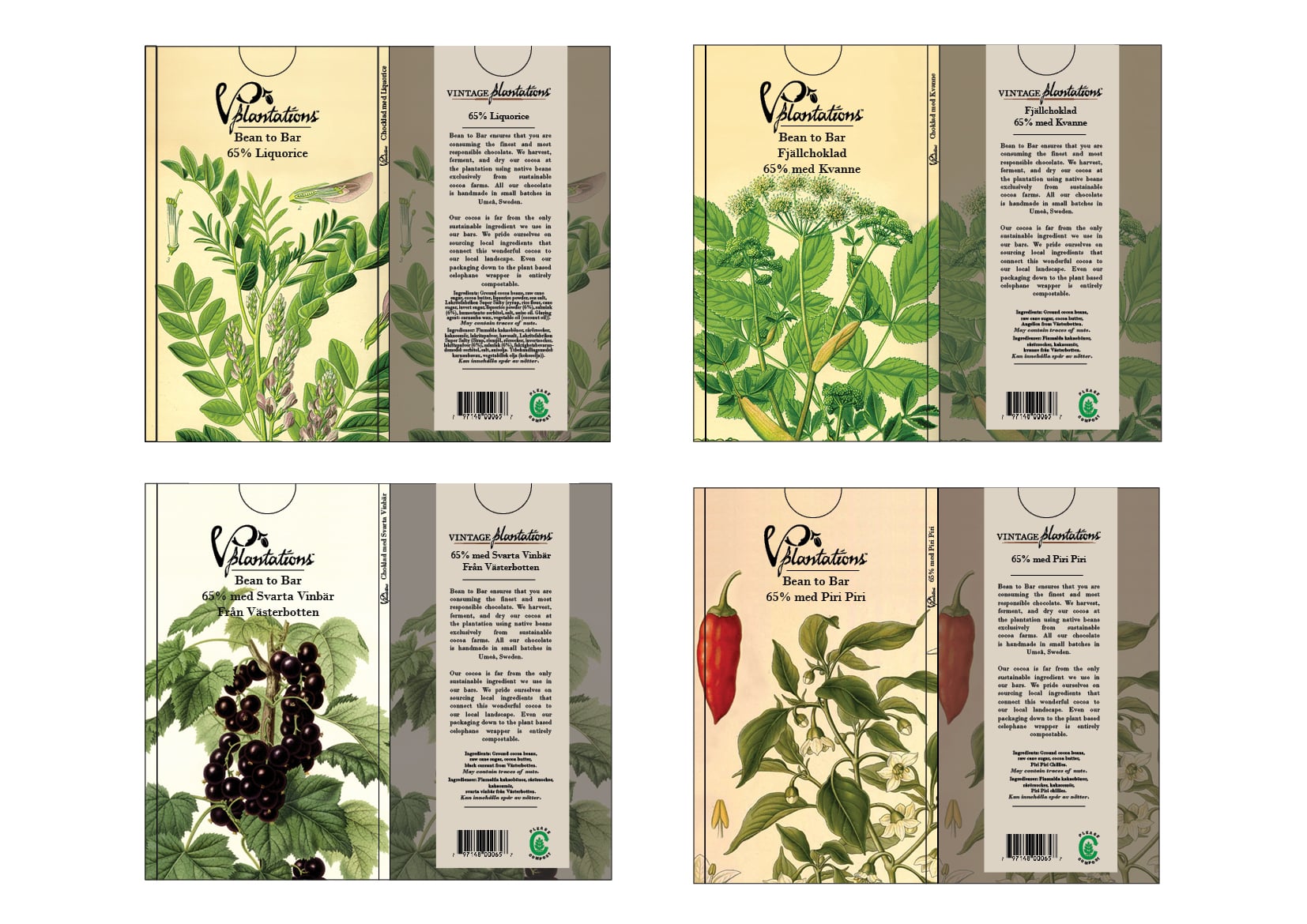
Ingredient specific packaging
On the chocolate bars that have specific or specialty ingredients I decided to highlight this by utilizing scientific illustrations of the ingredients in the packaging design. By doing this the consumer can easily identify what the chocolate bar contains.


PACKAGE CONSTRUCTION
In order to make the packaging easily resealable, I decided to construct the package using a sleeve type cover. The chocolate would be sealed using compostable plastic and wrapped in a paper sleeve. The design of this sleeve would be a topographical map of Ecuador and contain a mission statement from the company. The outer cover would be either a local artist work or a scientific drawing depending on the bar.
FINAL DESIGNS
Individual bars
I separated the chocolates in the company's line into two groups of four. The first four are purely chocolate with no added ingredients. They only vary in the percentage of cocoa. For these I chose to utilize the work of a local artist named Gunnar Kalen. The second set of four are bars that have a specialized ingredient. For these I highlighted this by using a scientific illustration of the added ingredient.

Gift Pack
For the gift pack I wrapped the newly redesigned chocolate bars in a seed paper sleeve. Once the chocolate is consumed the user can rip up the wrapper and toss it into their garden. Within this wrapper is an assortment of seeds of local flowers and ingredients from the chocolate. The user is being gifted not only high quality and responsible chocolate, but also a start for a home garden.

Gardena Handsaw
Gardena Handsaw
ERGONOMICS PROJECT : GARDENA HANDSAW
UID : 2015 : 4 weeks
To design a user adaptable handsaw that is safe for casual users, ergonomic and efficient while demonstrating a premium feel.
Design an ergonomic product
The purpose of this project was to get a practical understanding of the industrial design process with a focus on user-centric ergonomics. Working in tandem with Gardena we were posed the design challenge of redesigning a fixed blade handsaw for home gardeners between ages 30-70. The target product was one that displays the best ergonomics, clear branding, and fits in with the Gardena product line DNA.
how is a handsaw used in a home garden setting?
Workshop testing
After seeing how others utilize a hand saw certain questions were raised. How does the ergonomics of the handsaw change when the height of the branch being trimmed is changed (higher vs lower)? How is the existing saw's ergonomics while performing an undercut? How efficient does the existing saw cut? Using the workshop I tested the various cut angles in addition to attempting the undercut technique with the existing Gardena as well as two other competing saw designs. I found that the angle of cutting is frequently changing and the saw is used in short bursts of activity. I also found that the current handle designs of hand saw force the user into some awkward body positioning when undercutting.
Field testing
In order to gain a better understanding how users actively use hand saws while preforming tree maintenance I participated in a field test with Umeå Kommun workers. This field test and further research reviled the importance of using an undercut while pruning a tree. An undercut is when you cut underneath the branch then cutting off the outer part of the branch. Once the weight of the branch is removed the user can safely finish with a cut that removes the branch at the trunk of the tree. By using this technique you ensure that the bark of the tree doesn't get stripped, damaging the tree. It also allows for better cut accuracy closer to the trunk giving the tree the best shot at healing over the branch wound and preventing rot.


Task analysis
Once I had an idea of what features represented a Gardena product a full analysis of how this product would be put to use by a passionate home gardener was needed. Starting from how the saw was stored to how it is used I analyzed how the workflow would look. Questions that arose during this analysis included: How can the blade be protected during storage and transport? Who will be primarily using this saw? What kind of environment is the saw usually being used in? and What is the proper technique to use when pruning trees around ones house and property?
Gardena Design DNA
In addition to analyzing the ergonomics of the existing hand saw, with the aid of classmates I conducted a brand form analysis. Through doing this I would ensure that the new hand saw fit within the line of products Gardena produces. There are distinct feature that are shared through out most Gardena products. The first and possibly the most noticeable is the color used and how these colors are balanced based on the use of the product. The aqua color is the defining color for the brand Gardena. This is used as the color on the body of the products. Anywhere the user grips the product is colored black. Orange is used to inform the user of an interactive aspect of the product. Two more form features that often appear in Gardena products are parallel lines and circles
Three main functions
After conducting research in the field and in the workshop I narrowed down exactly what functions that I felt were required from the newly designed Gardena saw. When starting to think about these functions, with the help from fellow classmates, I brainstormed on what the functions could be as well as some words that represented the form language that would guide me through the ideation and sketching process. The three main words that came up were: QUALITY, INTUITIVE, AND ENJOYMENT.

3 Cut Method
The saw should ergonomically allow the user to execute an undercut when pruning a tree. This undercut function should be designed into the product so that the action is effortless and intuitive.

Safety
The saw should provide the user with a sense of safety and security during use. It should also ensure the safety and health of the tree being trimmed with minimal effort from the user.

Strength Maximization
The saw should be adaptable to all ages and members of the family. While all ages need to be considered, when focusing on the ages 30- 70 the saw needs to maximize the amount of force needed to operate.
three Concepts to address these three functions


Concept 1 : Straight Handle
Drawing inspiration from traditional Japanese hand saws that also operate using a pulling motion, my first concept explores the ergonomics of a long straight handle. The grip in this concept was designed with the intention of aligning with the form language of quality and intuitive. The segmented black grip is angled so when viewed from the top and back it has a directionality indicating a pull motion. Through these ideation sketches I began explore to use of a "fish belly". The more curved design also aligned better with the form language of enjoyment.
Concept 2 : Hand Protection Handle
With the form language words enjoyment and quality. Within the form language of quality, safety became a highlighted term. This concept became centered around how a handsaw can communicate safety to the user. I achieved this through separating the hand completely from the saw blade. I also included more flowing curves to help illustrate enjoyment.
Concept 3 : Undercut Handle
The importance of having a saw that effectively and ergonomically allows the user to undercut led to the concept of a shifting blade that can be used as a traditional pull saw and then flip on itself and be used to undercut with minimal effort from the user. In this design I heavily explored the role of circles within the design language.
3D Model Making
After narrowing down my ideation process to three primary concepts I continued developing my designs by producing to scale foam models. By doing this I was able to see which aspects of each design were either beneficial of immediately apparent that they were unfeasible or in need of changes. I explored varying lengths in the straight handles and varying angles within the closed and open grips. One thing that was starting to become clear was not only the angle of the handle in relation to the hand but also the proximity of the hand to the saw blade. The closer the hand is too the saw blade the more efficient and accurate the saw seems to be, but it also leads to the anxiety of the user cutting their hand. After making these models I had plenty of questions going into the next phase of my design process, user testing.


User Testing
Going into user testing I had two primary questions that needed answering: Do users prefer a long, medium, or short handle? and What angle handle in relation to the saw blade do users prefer? I provided the users with sets of models for them to grab and feel without any resistance in order to get their initial reaction on how the handles sit in their hands. Once they had selected their top three handles I then conducted a pull test using a demo blade and a rubber band in order to simulate a pulling saw motion. I then got their feedback on which of their selected handles either improved or got worse with the resistance.
Findings
My two main questions were answered. Users preferred a shorter handle and one that had much more angle than a straight Japanese handsaw style. They also confirmed my suspicion that the closer the hand was to the saw blade the more in control and stable they felt while sawing. This became even more evident when the saw handle was used in a resistance test. I left the user test with a much better idea of what I wanted to address in my further refinement of my designs.


final design


Strength Maximization
After the user testing I had the goal of combining what I had learned from the ideation process, the feedback received, and the three main functions. I arrived at the angle of the handle by finding the middle ground between the two most popular handles from the user testing. I then took that angle and moved the hand as close to the saw blade as well as maintaining an alignment of the arm and saw blade. This made it possible to transfer the force needed directly to the blade efficiently. By moving the hand very close to the cutting teeth, aligning the whole arm with the saw blade, and placing the center of gravity just ahead of where the saw meets the handle allows for an efficient and accurate pull saw.
SAFETY
I decided to go with a rounded and flowing feel to the overall design of the handle. While the hand is placed relatively close to the cutting teeth of the saw blade, the risk of the user cutting their hand is mitigated by fully enclosing the hand with a protective guard. Combine this with a very friendly and inviting overall form the saw is designed in a way that welcomes the user to use it and it does not come across as overly technical. The saw is designed to guide the user in conducting the safest possible tree maintenance not only for the user, but for the tree as well.
Ergonomic undercut
One of my main three functions that I set out to achieve was how to design a handsaw that allows for the safe and proper use of the three cut method. Initially I thought of moving the blade to various positions rather than the arm. Then I thought of various ways to design the handle angle in order to have the whole saw rotated and flipped in order to facilitate an undercut. These solutions either were over designed or impractical solutions that disrupted the workflow. These solutions steered away from my form language of intuitive. Instead I chose to design the blade to have a curved saw teeth on the top of the saw. Having this design feature would allow the user to use the same arm positioning and require little in terms of readjusting. The curve not only fits in with the rest of the handle's rounded design but it also allows for more efficient cutting given the shorter surface area of cutting teeth.
HOW IT FITS gardena's design dna
While this hand saw is unique and specifically designed, it does align with the brand DNA of Gardena. It has a strong, but not overstated, influence from circular forms. The placement of the black grips aligns with where the user will be gripping and pulling on the saw, and the simplicity and elegance of the design gives it an overall premium feel. Overall this saw provides the user with an adaptable product that is safe for casual users, ergonomic and efficient while demonstrating a premium feel.
Tränare Grip Light
Tränare Grip Light
using light to strengthen personal security
UID : 2015 : 4 Weeks
Project Brief
A well known company, in my case IKEA, wants to enter a new product area, and develop a new product for portable light in the private home environment. The handheld lighting device the company wishes to develop is a product for enlightening the surroundings when needed. The product must have physical buttons and be battery operated.
Target group and company
I chose to design for IKEA and aid them in improving the little things that occur in the private home environment. The target age group that I was assigned is 65+ years of age.
Group REsearch


Brainstorming
In order to get a better idea of both the company that we were working with and the target age group my group and I employed various brainstorming techniques. Some of the techniques we used as a group were quick brainstorming on the company, IKEA, and the age group +65.
RESEARCH AND SURVEYs
At the outset of the project my group decided to canvas downtown Umeå for people who fell within our target age group, +65. We prepared a set of questions that had come up during our initial brainstorming sessions. These questions included:
- What kind of house do you live in?
- What does a typical day look like for you?
- How do you enjoy your evenings?
- What type of lighting do you have at home?
- When was the last time you were in the dark and needed light?
- You need new furniture, where do you go to shop?
- What comes to mind when you think about IKEA?
- Do you have a mobile phone?
The perception of Ikea as a company is: Economic, Fun/playful, Practical, Easy/simple, Organized, DIY, Accessible design.
After brainstorming with my classmates and analyzing the responses of seniors from Umeå, we concluded that the perception of IKEA as a company is: economic, fun/playful, practical, easy/simple, organized, do it yourself, and accessible design. According to the IKEA website their self described motto is "It's the simple things that can help the day to feel extraordinary. To create moments that are special, even through everyday living...Make every day more wonderful". I embraced this concept and set out to analyze the daily life of users +65 and create a lighting product that made the little things in everyday life easier and more enjoyable.
The functions that my group and I determined the user group needed were:
standards:
- Reliability
- Preserve Habits
- Responsibility
- Selflessness
GOALS:
- Stay healthy
- Safety
- Comfort
attitudes:
- Being cautious
- Take it slow
- Conservatism
- Save money
- Being generous
main functions
provide security, improve visibility, and PORTABILITY
Early form focus in the process was creating a light that could transform from an atmospheric light to a flashlight.

Hiding in plain sight
Through the user research I determined that a traditional flashlight was rarely used by our test group. Those who did own a flashlight often had it hiding away in a drawer somewhere, unused. Drawing inspiration from IKEA's concept of designing products and furniture for the everyday tasks and doing it in a simple and effective way, I decided to work on a light that could adapt to the user. During everyday life the light would function as a normal atmosphere light. If there was an emergency the light could transform into a emergency flashlight.
fORM EXPLORATION
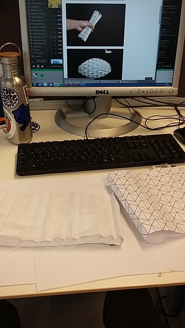
In order to design an adaptable light I explored the various ways a product could be designed to change shape. This research led me to origami. What fold called a "water bomb" would allow for a sphere to change shape to a cylindrical form. I set out to make a model myself but was ultimately unsuccessful in doing so. This effort was not a waste however as this origami inspiration led to the final design form.
design goal
to design a light device that improves the user`s sense of safety/security in their home environment.
GRIP STRENGTH AND pERSONAL SECURITY
The research and surveys led to me confirming that elderly people +64 in age spend majority of their time in their homes. While some do get out and exercise by walking or meeting friends majority tend to be significantly less active than they were in their youth. From this one of the first areas that this decease in strength is noticed is in their hands. When you lose control of your own surroundings your sense of personal security deceases. Everyday activities like opening doors, jars, and activities that require fine motor skills become more and more difficult.
Why focus on grip strength?
I am an avid climber and I use a grip strengthener to help train increase my grip strength. This work out device was my initial source of form inspiration as it got me thinking about the various motions that could be used in building grip strength. the main ones I began considering were squeezing and twisting. My grandmother experiences a similar lack of hand strength and this caused me to start thinking about concepts that incorporated hand strength into a lighting device.


FUSING GRIP STRENGTHENING AND LIGHT
After focusing in on using grip strength training to make the little things in life easier and increase the user's personal sense of security I came up with three potential solutions. My goal remained to make a light that hid in plain sight and one that was used in everyday life rather than being stored away in a drawer. The first concept was a dynamo powered light that charged itself and strengthened the user's grip simultaneously.
This was less appealing because it functioned more as a traditional flashlight. The second was a mug that had a twist grip strengthening feature and a LED light in its base. The concept was once you were finished with your beverage you flip the mug and use it as an atmosphere light. The final concept was an interactive light that turned on once you started squeezing the training ball connected to it.


I decided to continue to develop the third concept because it could be used throughout the house and live in the space the user occupies regularly. This would allow for the maximum potential of use and life improvement.
Refinement of grip light concept
3D model making
In order to gain a better understanding on exactly how the end result would look, I made multiple sketch models while I was sketching out my concepts on paper. The work with origami in the early stages came back here and helped to influence the final the final concept and appearance. I used polyurethane foam that was soft and allowed for quick explorations of various forms.


using light as a reward for hand strength training.
Light interaction
Rather than only use light as the end result I decided to use it as a reward to encourage further use of the grip training ball. The way the light functions is through these basic steps:
- The user removes the ball from its cradle.
- By pressing the button at the bottom of the cradle the user activates the system.
- The grip training ball has a sensor inside that detects when it is being squeezed.
- Once it senses that the ball is being used it turns on the light.
- For every 1 minute of use with the ball the light stays on for five minutes.
- After 1 minute of continuous use the light pulses indicating the user should switch hands.
- When not being used the light slowly dims.
- The ball must be returned to the cradle to turn off the system to help prevent the ball from being lost.
Final design

Graphic Design
Graphic Design
dieter rams : Layout Exploration
Personal Project : 1 Week : 2014
In a personal project I decided to do an exploration on one of my favorite product designers, Deiter Rams. His 10 principles of good design, particularly as little design as possible and environmentally friendly, have had a strong influence on the form language and approach I take to my designs wether it is in product design or in graphic design. In this exploration I set out to experiment with how type can be used not only as a communication tool but also as a way to create abstract shapes in the context of a layout. I also attempted to apply some of his 10 principles in the creation of these layouts.


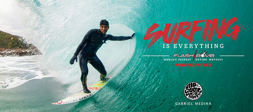
Rip curl : work experience
Six Month Graphic Design Intern 2014 : Employed as Print Shop Operations Assistant 2014-2015
My time as an intern at Rip Curl USA, a wetsuit company and leader in the surf industry, I was able to gain working experience within the design section of a marketing department. Our department was team oriented and regularly met to discuss the design direction of the company's print ads, wall displays, and external accounts. I was able to hone my graphic design skills. We operated using a style guide from the company's headquarters in Australia, but the designers, including myself were able to tweak and edit the designs within the set Rip Curl design style. I mostly worked on window displays and point of purchase designs for external accounts.